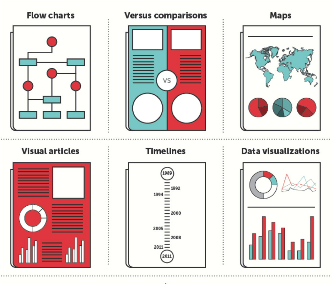
Data Visualization
- Sheridan Libraries
- Guides
- Data Visualization
- Introduction to Data Visualization
Planning a Data Visualization
Learn the steps to plan and implement a data visualization.
Designing an Effective Data Visualization
Learn how to design an effective data visualization.

Data Visualization Resources
Learn about the software packages, programming languages, and data visualization libraries available to you.
Data Visualization Consultants

"There is a magic in graphs."
"The profile of a curve reveals in a flash a whole situation — the life history of an epidemic, a panic, or an era of prosperity. The curve informs the mind, awakens the imagination, convinces."
- Henry D. Hubbard, National Bureau of Standards
What is Data Visualization?
Data visualization is the graphical representation of data for understanding and communication. This encompasses two primary classes of visualization:
-
Information Visualization - Visualization of data. This can either be:
Exploratory: You are trying to explore and understand patterns and trends within your data.
Explanatory: There is something in your data you would like to communicate to your audience. -
Scientific Visualization - Scientific visualization involves the visualization of data with an inherent spatial component. This can be the visualization of scalar, vector, and tensor fields. Common areas of scientific visualization include computational fluid dynamics, medical imaging and analysis and weather data analysis.
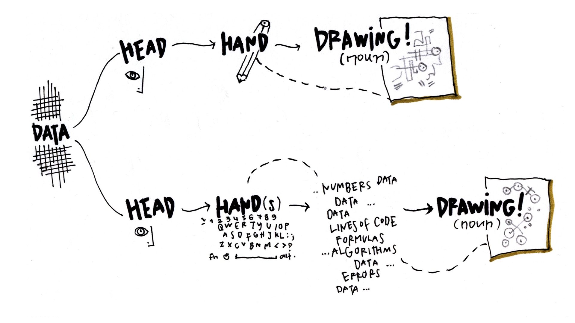
Why Visualize Data?
Good data visualizations allow us to reason and think effectively about our data. By presenting information visually, it allows us offload internal cognition to the perceptual system. If we see numerical data in a table, we may be able to find a trend, but it will take a significant amount of work on our part to recognize and conceptualize that trend. By plotting that data visually, that trend becomes immediately clear to our mind through our perceptual system.
A good example of this is "Anscombe's quartet", four datasets that share the same descriptive statistics, including mean, variance, and correlation.
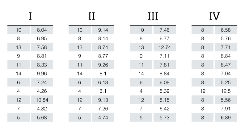
Upon visual inspection, it becomes immediately clear that these datasets, while seemingly identical according to common summary statistics, are each unique. This is the power of effective data visualization: it allows us to bypass cognition by communicating directly with our perceptual system.
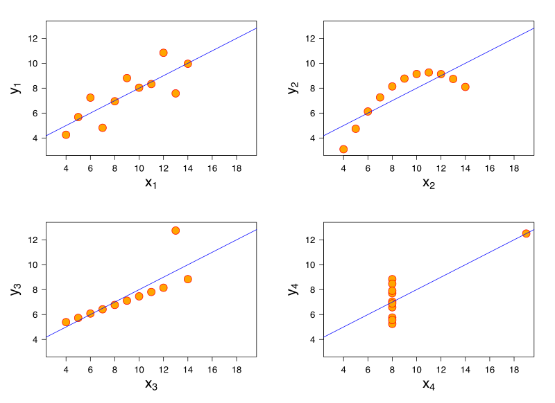
Anscombe's Quartet plot published under the terms of "Creative Commons Attribution-Share Alike", source: http://commons.wikimedia.org/wiki/File:Anscombe%27s_quartet_3.svg
Anscombe's Quartet table source: https://multithreaded.stitchfix.com/assets/images/blog/anscombes_quartet_table.png
| These materials are licensed under a Creative Commons Attribution-NonCommercial-ShareAlike 4.0 International License, attributable to Data Services, Johns Hopkins University. |