Data Visualization
- Sheridan Libraries
- Guides
- Data Visualization
- Scientific Visualization
Guide for technologies, techniques, and best practices for data visualization.
Contact Me
Introduction to Scientific Visualization
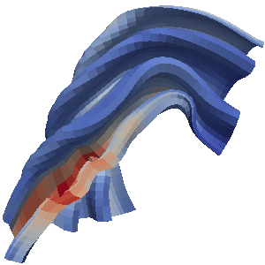
Scientific visualization is the process of representing numerical spatial data as images in order to better understand scientific phenomena described by the data. Some examples might include:
-
Volume rendering in medical images, where 3D volumes are generated by interpolating over sequential 2D slices from MRI or CT-Scans.
-
Surface rendering, such as a protein molecule, in which an isosurface is computed over the 3D volume.
Color in Scientific Visualizations
Choosing a Color Map
When pseudocoloring a scalar field for scientific visualization, the choice of color map is essential to conveying patterns and trends within your data or models.
Elements of an effective color map include:
| Perceptually Uniform | We do not perceive color uniformly by hue. We have an easier time differentiating some colors than others, thus color maps such as the rainbow map end up overemphasizing some differences in data while hiding others. |
| High Discrimination | Maximize discrimination by making colors change as much as possible over the range of the data you are visualizing, to ensure you can see changes in the data. |
| Implicit Order | Colors should have a natural ordering. If someone is viewing a visualization it should be apparent which colors are low and which are high without additional assistance. |
| 3D-Shading Friendly | Dark colors hide shadows rendered to make an object appear 3D, so if you are using shading, ensure you select a lighter colormap that does not obscure shading. |
| Color Blind Friendly | Select a colormap that allows with color-blindness to effectively differentiate colors. |
| Aesthetically Pleasing | While subjective, aesthetically pleasing color maps will help make your visualizations more attractive to your intended audience. |
-
Kenneth Moreland Color Advice
 This page provides advice for using colors in scientific visualization. More specifically, this page provides color maps that you can use while using pseudocoloring of a scalar field. The color maps are organized by how and where they are best used.
Scientific Visualization Libraries
-
ParaviewParaView is an open-source, multi-platform data analysis and visualization application. ParaView users can quickly build visualizations to analyze their data using qualitative and quantitative techniques. The data exploration can be done interactively in 3D or programmatically using ParaView’s batch processing capabilities.
JHU Availability: MARCC through Spack -
The VIsualization Toolkit (VTK)The Visualization Toolkit (VTK) is open source software for manipulating and displaying scientific data. It comes with state-of-the-art tools for 3D rendering, a suite of widgets for 3D interaction, and extensive 2D plotting capability.
JHU Availability: MARCC through Spack -
VisItVisIt is an Open Source, interactive, scalable, visualization, animation and analysis tool. VisIt contains a rich set of visualization features to enable users to view a wide variety of data including scalar and vector fields defined on two- and three-dimensional (2D and 3D) structured, adaptive and unstructured meshes.
JHU Availability: MARCC through Spack - Experimental Support Only, Some Features Missing -
VisTrailsAn open-source scientific workflow and provenance management system that supports data exploration and visualization. VisTrails provides a general infrastructure that can be combined with existing systems and libraries. Official releases come with several packages, including VTK, matplotlib, and ImageMagick. The system is written in Python/Qt and runs on Mac, Unix and Windows.
